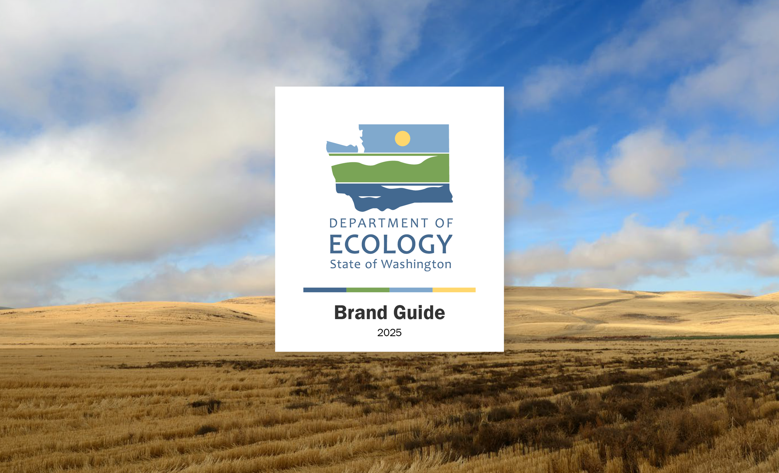
One of my first projects at Ecology was creating a brand guide. What started as a logo and a set of colors & fonts, grew into a comprehensive visual guide. The guide covers how to use the logos and colors, and also how to apply Ecology’s brand to imagery, writing voice, videos, and icons.
The goal was to communicate the importance of “brand” to an audience with varying levels of design experience. This effort grew into a suite of resources beyond the guide, including email templates, accessible PowerPoint templates, InDesign templates, social media, graphic resources, and rolling out Canva as a design resource for staff. We revisit the guide every 2 years to update and improve our guidance, with the latest update including accessibility and language access tips.
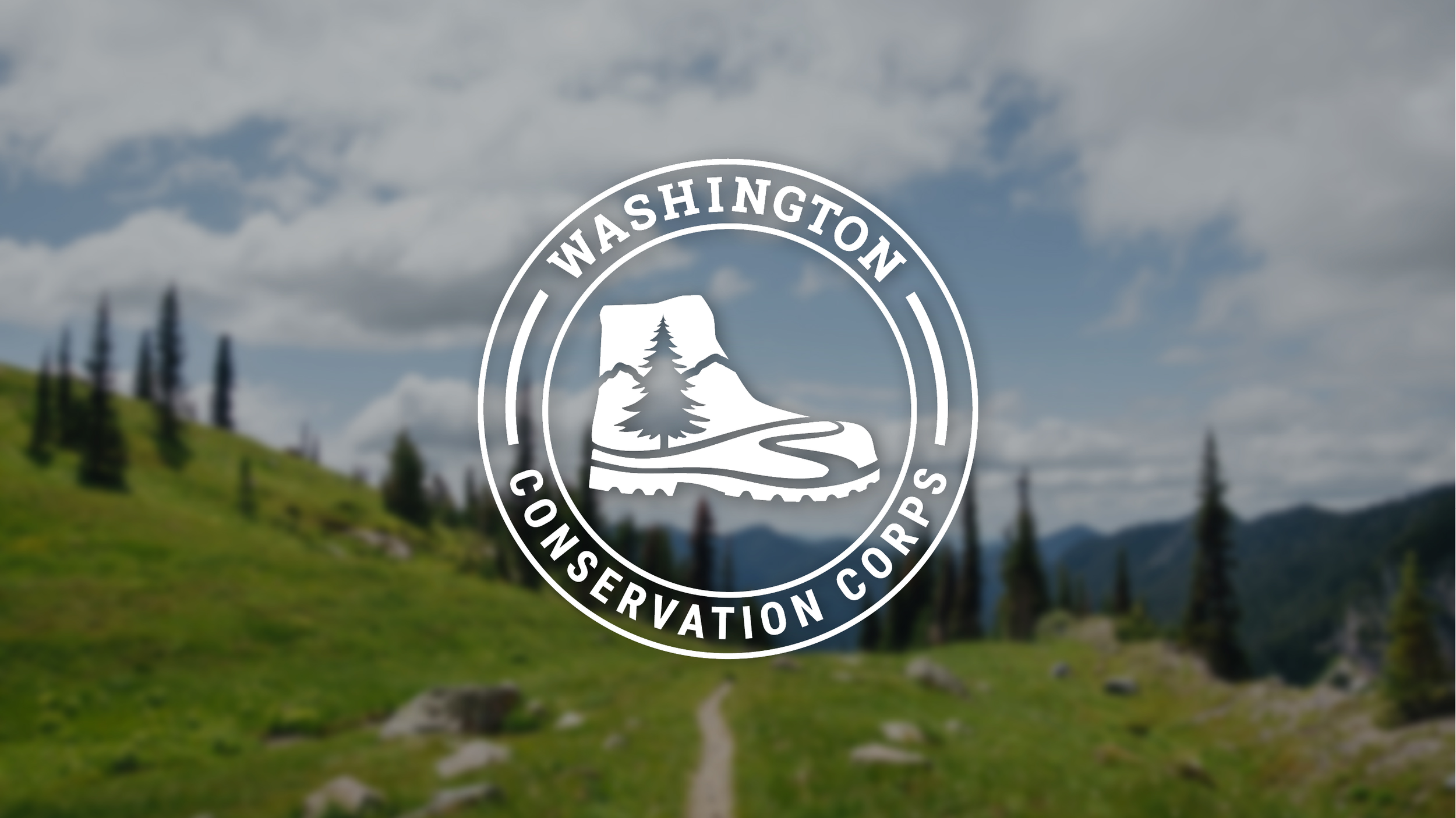
For the Washington Conservation Corps rebrand, we wanted a fresh logo that would still be timeless and reflect the organization’s established history. 40 years of tradition shouldn’t mean boring or stuck in the past — WCC is always learning, growing, and innovating. We also wanted to reflect the hardworking crew members who bring the fun, grit, and passion that keeps their day-to-day work fresh and fulfilling. Using input from a staff survey and an iterative design process with a core branding team, we created a new look and feel that was polished, friendly, human, and inspired by their environmental work.
I had the opportunity to design the Climate Resilience Strategy document. This was designed to be a thorough, but easy-to-understand overview of the work that Washington is currently doing to respond to climate change, and the strategies for continuing that work into the future. The design elevates photos of the work to tell the story, and uses icons and consistent themes in the page layouts to guide the reader through the information.
View the full Climate Resilience Strategy document here.
Every two years, Ecology develops a strategic plan that guides its work. The goal was to create a design that elevated the mission of the agency, and communicate a vision for the next two years that had a clear brand style and voice. I wanted the design to feel clean and formal, but also inviting. Emphasizing the environmental brand colors and choosing bold imagery from across the state helped paint the future that was envisioned in the plan.
It was created primarily as an interactive document, since it’s mostly viewed online, and was also made available as an accessible PDF.
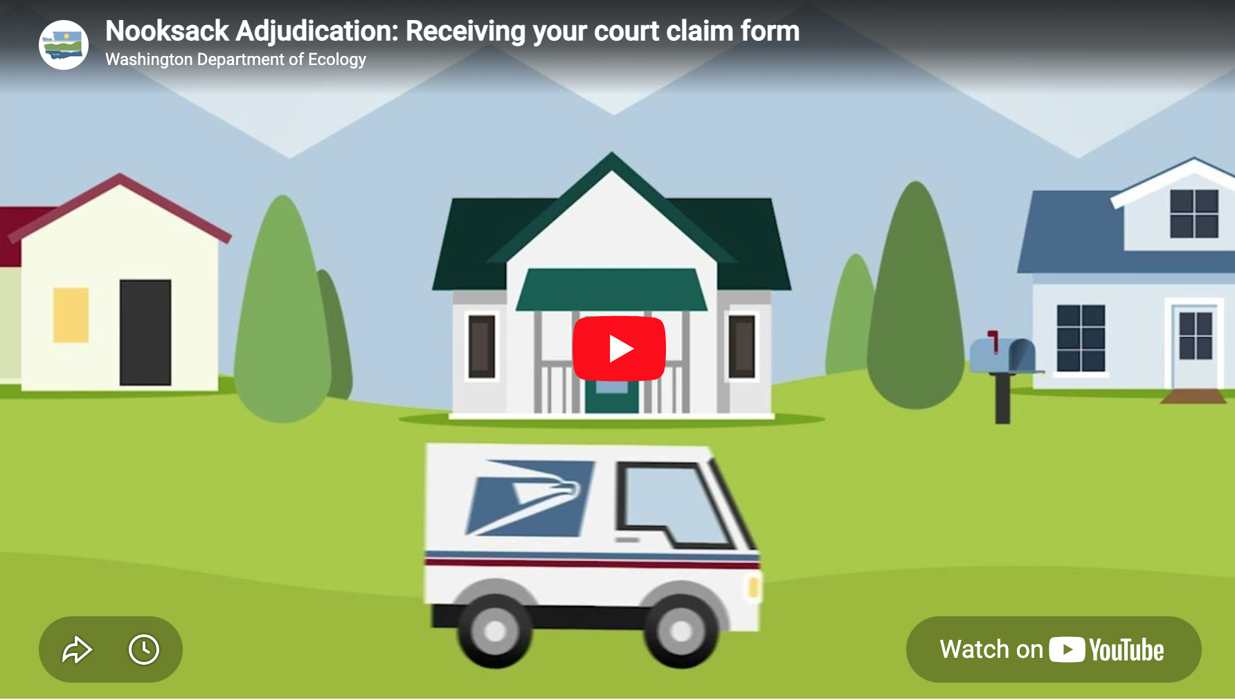
A collection of video work from Ecology, which includes animation, long form storytelling, and short form social media content. All styles of video come with their unique tones and challenges, and it’s an interesting challenge to see how the brand voice translates to each message and audience — earnest and thoughtful for some messages, quick and light for others, but always transparent, welcoming, and knowledgable.
Ecology’s work can be highly technical and complicated, and infographics help communicate that information visually.
As the graphic designer of the Corporate Affairs department, I had the privilege of partnering with one other designer to create the 2017 Annual Report for ascena retail group, inc.
In our partnership, I ideated the overall look & feel of the report with a clean design that showcased the company’s unique range of brands, while also highlighting the diverse groups of women that each brand serves.
Staying true to ascena’s blue and gray as the base for the design, I let the brand imagery speak for itself and add life to the report – showing that truly, ascena’s core purpose is to serve all women and all girls. This report was printed and distributed to investors in fall 2017.
When maurices moved into their new corporate headquarters building, I created a Welcome Guide to acquaint associates with the new space and guide them through the move transition. The goal was to have this guide available for the intial move, and also have some flexibility in the design to add or update pages for future new hires.
The final product was a 3-ring binder with easy-to-navigate tabs and a folder for additional items (such as new IDs, keycards, etc.) All of the paper and the binder was made of recycled materials.
This project was my responsibility from start to finish. I was involved in gathering and organizing the information included in the book, chose the format & materials, and worked directly with the printer throughout the design & printing process.
Manchester Classic is an opportunity for hikers, climbers, and all-around adventurers to take their favorite peak-bagging memories and turn them into custom topography art.
I created the logo, drawing inspiration from both the topographic lines and the natural wood grain in the art. The logo is currently used on the store website, and social media pages. I also dreamed up what the brand could expand to be in the future, with full email and online marketing.
Trail photography from my 2018 thru-hike of the Appalachian Trail, and my 2019 thru-hike of the Pacific Crest Trail.